There are three kinds of lies: lies, damned lies, and, statistics – Disraeli. I recently finished reading the book – How to lie with statistics by Darrel Huff. This book was first published in 1954. Even today it is very relevant and it explains how an uncritical reader can be fooled by media, politicians, and, other entities by using statistics. In this post I will go through some of them.
1. Biased Sample
Literary Digest was a popular magazine in the US. Before the 1936 presidential elections, the magazine surveyed 10 million telephone and magazine subscribers to find out who they would vote for. The survey results came out with Landon getting 370 votes and Roosevelt getting 161 votes. But the actual results were completely different. Landon got only 8 votes and Roosevelt 523 votes. What went wrong with the survey? In those days only wealthy people had telephones and they favored Landon as he was a republican. The sample chosen was not representative of the entire US population. It was biased.
For the sample to have any predictive value it should be (1) representative of the entire population (2) members from the population should be randomly selected.
2. Beware of averages
Bush administration came out with a plan for tax cuts. They claimed that if their plans were implemented then American families would get an average tax reduction of $1,083. But more than 50% of the American families would not even get $100 in tax cuts. Did the Bush administration lie? No. They used mean for arriving at $1,083 and it is distorted by outliers and hence this figure was not applicable to majority of the families. The median figure is less than $100. An average should be qualified (mean, median, or mode). If not then the reported figure might not have much value.
Sometimes a qualified average is also dangerous. A six foot person drowned in a swimming pool which had a mean depth of 4 feet. How is it possible? The range of the depth was between 3 feet and 10 feet.
The image given below clearly explains 3 types of averages.
3. Small samples can have extreme outcomes
The probability of a head in a fair coin toss is 1/2. I flipped 5 coins using random.org and I got 5 heads. How is this possible? The actual results converge to the probability of 1/2 when there are very large number of trails.

One of the research concluded that most successful schools, on average, are small. Based of this data Gates Foundation made a substantial investment in the creation of small schools. Are small schools really better? No. If the statisticians who reported the Gates foundation had asked about the characteristics of the worst schools, they would have found that bad schools also tend to be smaller than average. The truth is that small schools are not better on average; they are simply more variable. Results from small samples can have extreme outcomes and hence we should not rely on them.
4. Graphs and Pictures
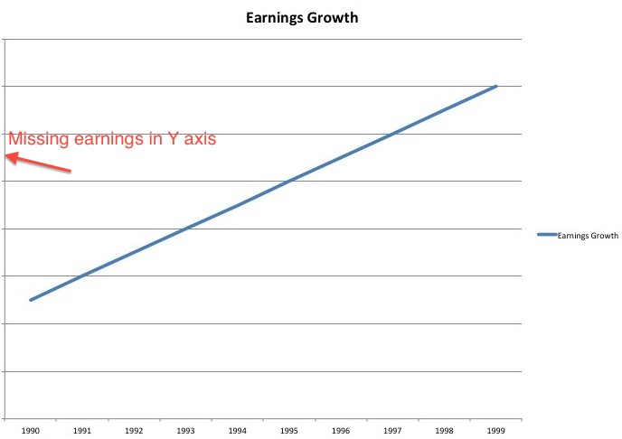
Given below is the earnings growth of a company from 1990 to 1999. The graph looks terrific and we see that the earnings are exploding. But there is one issue. The earnings numbers are missing in the y axis. I purposefully removed it. I drew the graph with 1990 earnings at $1 and 1999 earnings at $1.1. In 10 years the earnings grew by just 0.96%. When you look at any graph make sure that numbers are present in both the axis.
For the same company consider the earnings growth from 2000 to 2005.
| Year | Earnings |
| 2000 | 20 |
| 2001 | 20.4 |
| 2002 | 20.8 |
| 2003 | 21.2 |
| 2004 | 21.6 |
| 2005 | 22 |
In 6 years the earnings grew from $20 to $22. Nothing great and the annualized return comes to 1.60% The graph looks normal.
For the same data I redrew the graph and it appears exploding. How can this be possible? The graph starts at $20 instead of $0 and the y increments are in 0.2 and hence it gives an illusion of tremendous growth. When you look at any graph make sure you notice the starting value and the increments.
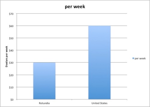
Consider that an average (median) weekly wage of carpenters in the United States is $60 per week and in Rotundia it is $30 per week. The bar chart for this data clearly represents this fact. The height of the bar for United States is twice as tall as Rotundia.
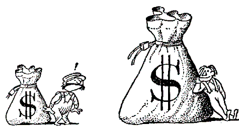
If I want to make the story appear dramatic then I can represent this as an image. The image gives us an impression that United States is much more prosperous than Rotundia. Why? The height of United States went up by 2 which is correct. But the width of United States also went up by 2. This gives an illusion that United States is 8 times more prosperous than Rotundia. Why 8? Let us take the base volume is x3. if the base doubles then we get (2x)3 which is 8x3. When you look at an image make sure the width is not altered.
5. The SemiAttached Figure
If you cannot prove what you want to prove, demonstrate something else and pretend that they are the same thing. For example you invented a medicine which can cure colds. But you have no way to prove it. What do you do? Publish a report telling that your medicine killed 32,868 germs in a test tube. Get the report certified by an known authority. You can run an advertisement telling that the medicine killed germs in a test tube and hence it will also cure cold. Remember to question the relationship between what is claimed and what is being marketed.
6. Correlation does not explain causality
Correlation between two variables need not explain causality.
Consider the following headline – Bottled Water Linked To Healthier Babies. Is this really true? The question we need to ask is who buys bottled water? Affluent parents are more likely both to drink bottled water and to have healthy children.
In New Hebrides, people had a conviction that lice in bodies produce good health. Observation over the centuries had taught them that people in good health usually had lice and sick people very often did not. What is the actual reason? The person who was sick had fever and hence his body became too hot. Lice does not live in hot bodies and hence it is not found in sick people.
Closing Thoughts
Statistics is an useful tool. Sites like Amazon, Netflix, Facebook, and many others use statistics to predict items that we like. But like any useful tool it can be misused. It is our duty to know what is true and what is not. Next time when you consume any statistical information make sure that you ask the following questions (1) Who says it and what are his incentives (2) How does he know it (3) Does it make sense.


Hi,
I recently stumbled upon your blog and i liked it from the word go. Its very enriching to learn and know which otherwise i would have not known
I would appreciate if you suggest me with a decision to read a book between “How to think like sherlock holmes” and ” A few lessons from sherlock holmes”.
Do these books differ on talks and topics covered or are just some extended part and intertwined. I love reading as many books as possible covering wide areas and topics but reading the same topic in different books is sort of boring. Hence, it would be nice if you can help me with the same as you have read both those books.
Thank you
Thanks Pradhan.
If you have already read the book ‘Thinking Fast and Slow’ then you will find similar contents in the book “How to think like sherlock holmes” . The only difference is Sherlock Holmes stories will be used to explain those concepts.
“A few lessons from sherlock holmes” is a very short book and it highlights all the important passages from Sherlock Holmes books. Reading this book I got a feeling that I am learning from Charlie Munger and Daniel Kahneman.
I would suggest read the book “A few lessons from sherlock holmes”
Regards,
Jana
THanks Jana
Reblogged this on Citizens, not serfs.